Design of the TATO Online Information System part 2
For the development of an information system to be successful, it is necessary to be clear about what is needed. From the outset our aim with this project was to be able to answer some key questions which include:
- How many people are employed in the industry (by TATO members)?
- What are the education levels of people employed in the industry?
- How many tourists come to Tanzania and when?
- Where do tourists go and what do they do?
- How much in gross sales is generated?
This is a small sample of the questions we wanted to answer. For a bit more background and context, take a look at my previous post on this project.
Knowing what knowledge you want to know determines what data needs to be captured and also importantly the effort required in processing the data. The distribution of processing effort and resulting knowledge usefulness tends towards a bell curve; the more effort you put into processing the data, the more useful the information you get but up to a certain point. From this point onwards, more effort results in more knowledge but with diminishing usefulness.
Use of terms matters and the phrase 'diminishing usefulness' can be deceiving. This is not useless knowledge but rather very specific knowledge, so specific that it may not have wide usefulness. However this is context-dependent. If your business has 100 customers, specific knowledge about 2% of your customers, that might help you better market to them, is perhaps the point of diminishing returns. But if you grow to have 10000 customers, 2% is now 200 customers and perhaps no longer 'negligible'.
Making sense of data
Most of the processing of our captured data involved aggregation on an annual basis and we categorized the data into a series of datasets, each addressing a particular aspect. Each dataset is presented first in tabular form, showing the respective attributes per year.
Below are 2 example datasets with sample data. The first is a classification of TATO members based on
what services they are licensed to provide. It is common to have one company licensed to provide more
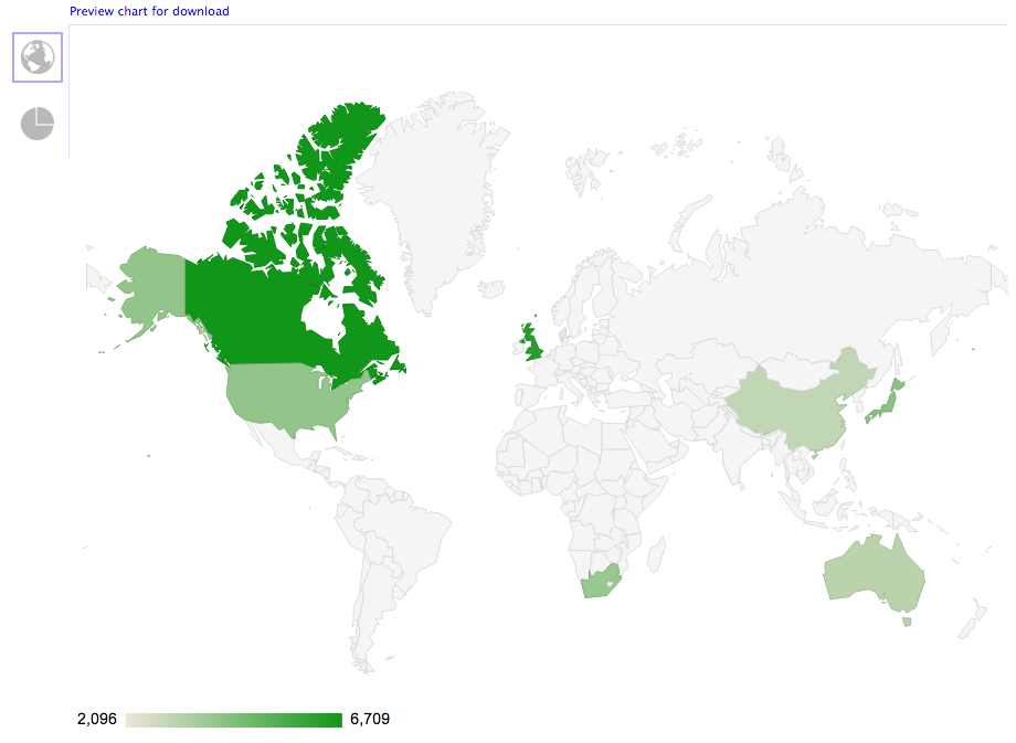
than one of these services. The second dataset is tourists received by country.
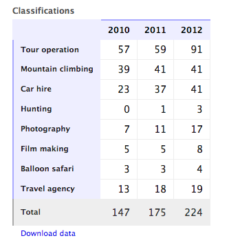
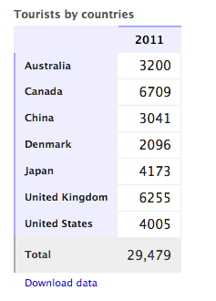
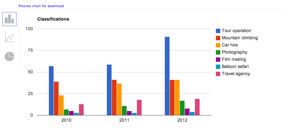
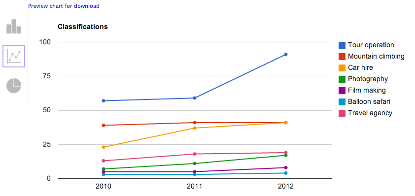
These datasets can then be visualized with a few choices of graphs. The first and second of the
following 3 graphs are visualizing the first dataset above (Classifications) and the third
graph is visualizing the second dataset above (Tourists by countries).
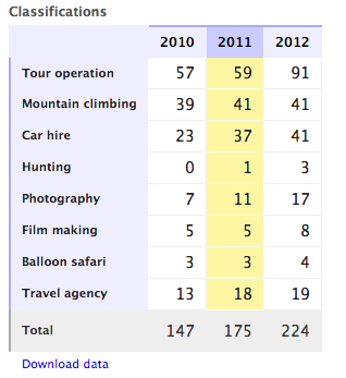
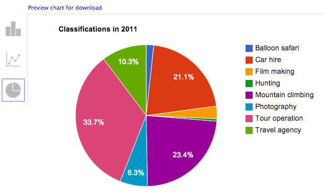
These data tables are interactive allowing the selection of particular years and or attributes. This
selection is useful for selective visualization of the data. The dataset below shows a selection of
the year 2011 and after it is a pie chart visualizing just that year.
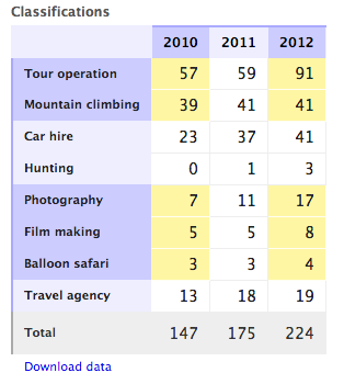
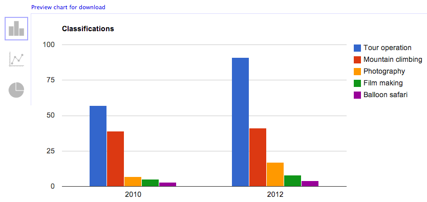
As a final example, below is a more particular selection of the dataset. This selection is only
interested in 5 of the 8 data attributes (Tour operation, Mountain climbing, Photography,
Film making, and Balloon Safari), and only in the years 2010 and 2012.
And what follows is a visualization of the selection.
Exporting data
All the interactive graphs generated can be saved as image files that can be incorporated in reports and all datasets can be exported to any spreadsheet or data analysis program. The data export option is useful for when there is a need to create very specific types of graphs or more particular customizations. It is also useful for easy sharing; a particular dataset, through a spreadsheet file, can be easily distributed as an email attachment.
Moving forward
This in many ways marks a first step in making sense of the happenings in the industry. Driven by need for more information and of greater accuracy, it becomes important to incorporate other sources of data. This includes immigration check points at airports and border crossings, hotels, and perhaps local airlines. Having more data sources would also help to normalize analysis finding, driving down inaccuracy.
Incorporating other sources of data offers an opportunity to come up with better ways of managing and sharing information. As is too often the case, information systems can end up being silos of information although there are numerous potential stakeholders who stand to gain from their shared use.
For TATO this hopefully marks a step in their drive to better serve their members and ensuring sustainability of the industry. With some of the information gained TATO should be in a better position to provide policy input. It should be able to knowledgeably participate in the conversation of where efforts to market Tanzania as a destination should be directed, which locations to concentrate on more (and which less), and which activities to promote.